
The short version
I worked on the foundations that connect design intent to implementation: component structure, tokens, accessibility, and usage guidance. The work combined hands-on library changes with cross-team alignment.
The challenge
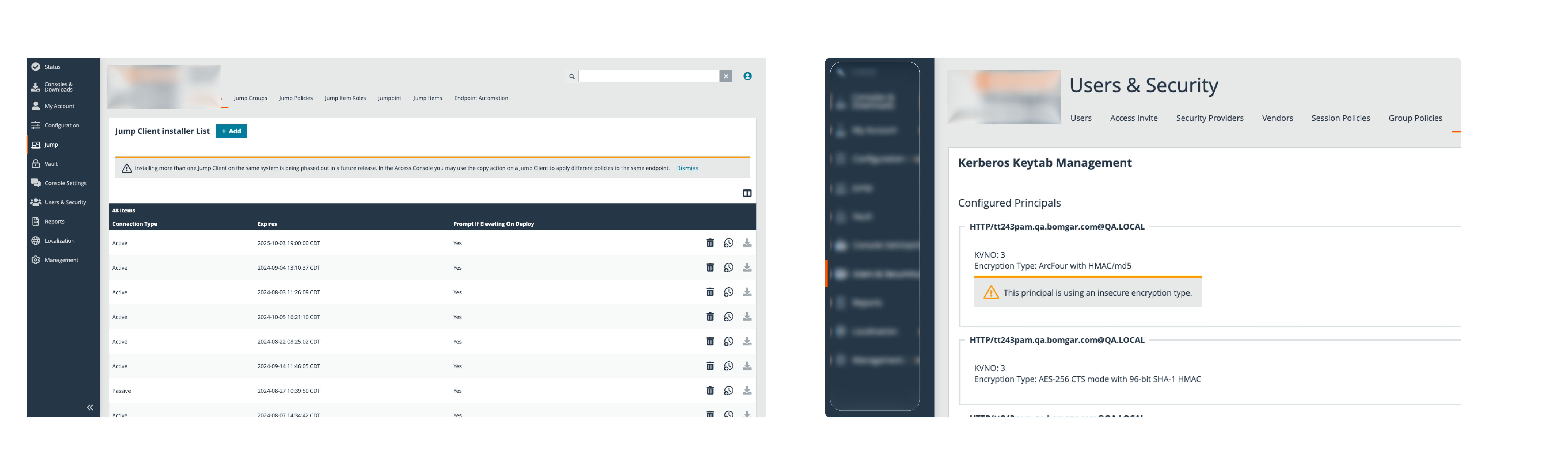
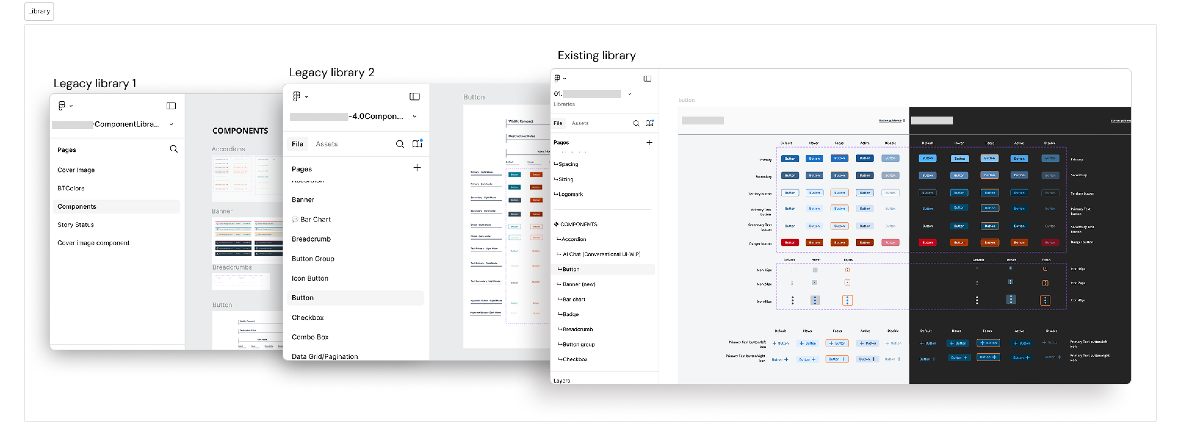
The earlier library had disconnected components and inconsistent naming, while design and implementation could describe different versions of the same pattern. A shared library was not enough if teams could not tell which behavior or value to use.
My role
I led UI foundation work and component modernization, collaborating with engineering on implementation alignment. I also modernized the documentation, working with the design-system manager on shared release guidance.
The decisions
Stabilize before expanding.
I audited the legacy component library, separated core and test work, and rebuilt common components around shared visual foundations. The intent was to reduce competing versions of the same pattern.
Make token relationships explicit.
In the current architecture, semantic and component tokens each reference primitives directly. Neither aliases the other. That keeps the two roles independent within the system’s implementation constraints.
Put guidance beside the component.
I helped move documentation toward Storybook and README-based guidance, bringing usage decisions, token references, and code examples closer together.
Review accessibility as part of the foundation.
Contrast, type, focus treatment, and color-dependent meaning were reviewed alongside component behavior and light/dark support. These decisions belonged in reusable patterns rather than being rediscovered in each product.
A closer look
Independent branches: semantic and component tokens do not reference one another.
What changed
The work established a shared approach to components, tokens, and documentation across the product ecosystem. It also made design and engineering alignment an ongoing part of maintaining the system.
Project status
The system supports work across eight products and nine teams. Modernization is ongoing.
What I learned
A design system has to be dependable at the point of use. A component needs both a clear structure and enough guidance for a team to know when and how it belongs.
Next project
A better way in. ↗