
The short version
The login screen looked ready, but important behaviors were missing. I mapped the supported access methods, defined what the primary action should do, and separated field errors from authentication failures.
The challenge
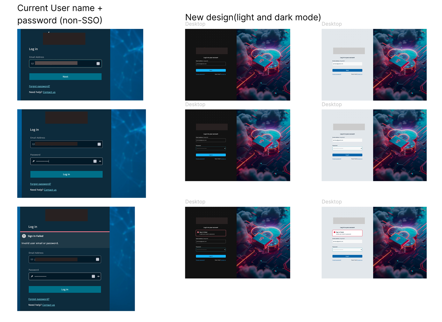
The project returned as a UI refresh after an earlier effort had stalled. Mapping the journey revealed a larger handoff problem: domain, domainless, and identity-provider behavior were not fully defined, and the screen included options the product did not support.
My role
I took ownership of the UI and interaction definition, revisiting production behavior and refining the design through team feedback. The work covered routing, the primary action, error placement, and consistent light and dark treatments.
The decisions
Let the email guide the route.
I brought domain-based, domainless, and provider-based access into a common starting flow. People could begin with information they already knew instead of interpreting the product’s authentication model.
Give the main action a defined job.
I replaced the generic “Next” direction with “Log In” in the refinement and specified whether the action continues locally, surfaces an error, or routes to a provider.
Correct the error pattern.
My first pass treated invalid credentials as an inline form error. Revisiting production behavior and security requirements changed that decision: formatting issues stayed near the field; backend authentication failures moved to a banner.
Remove promises the product could not keep.
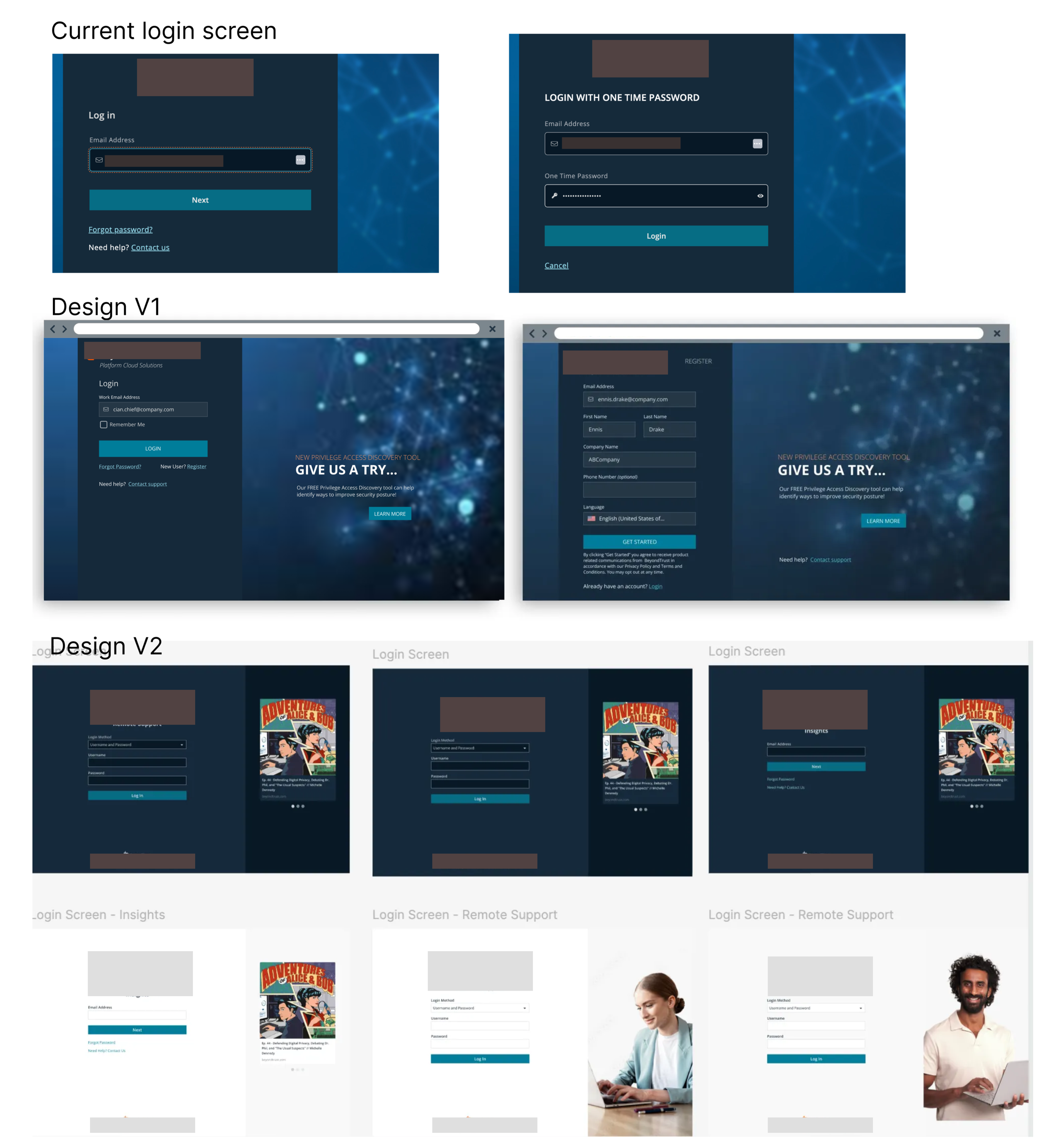
Self-registration, “Remember Me,” and promotional imagery were removed from the refined direction. The interface needed to match supported behavior before introducing optional content.
A closer look
| Situation | Design response | Reason |
|---|---|---|
| Input formatting issue | Message near the field | Help the person correct that input. |
| Authentication failure | Banner at the form level | Communicate a response from authentication, rather than blaming one field. |
| Identity-provider access | Route to the supported provider | Make the main action follow the access method. |
What changed
The result was a defined, email-led interaction model that the team could review alongside the visual design. It connected the screen to the supported authentication paths and made error recovery explicit.
Project status
The refinements were under review in November 2025. Post-launch results are not yet available.
What I learned
The most useful correction was changing my own error treatment. A form-like screen does not mean every failure belongs to a field; the source of the failure determines the pattern.
Next project
A sense of place. ↗