
The short version
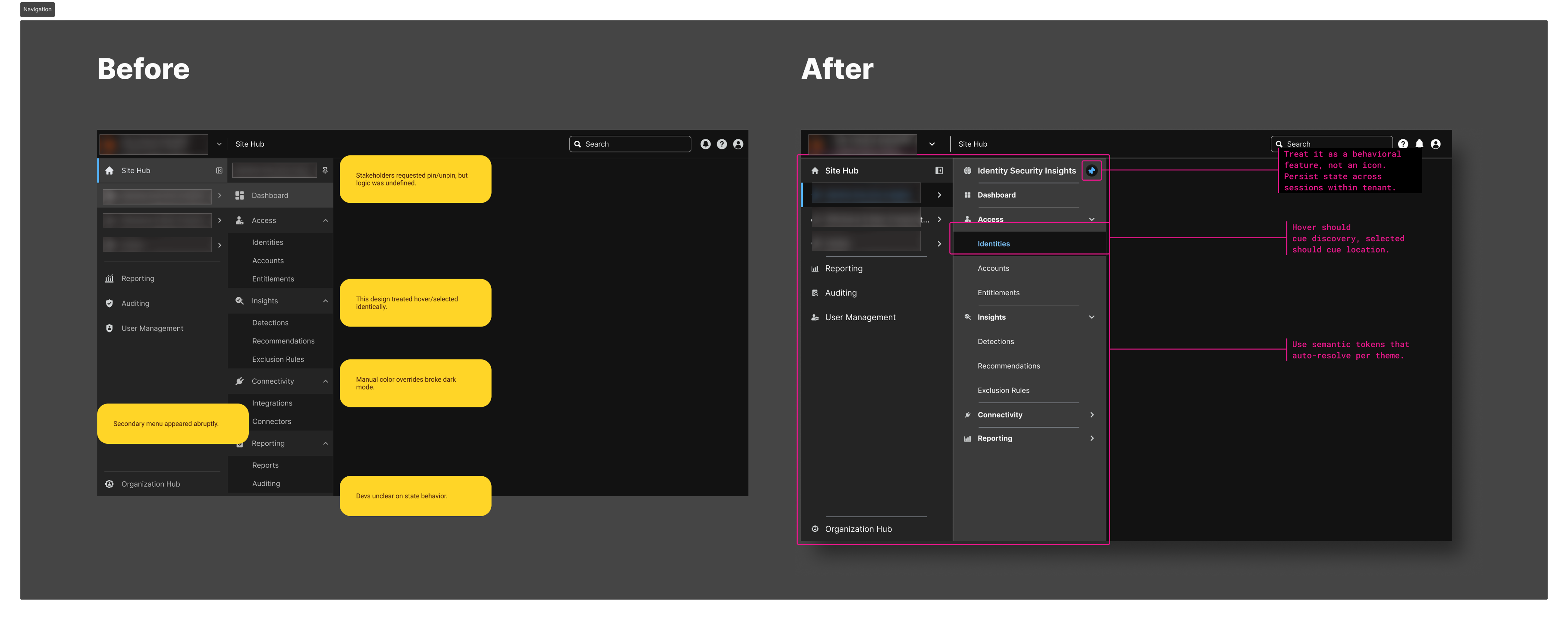
The visual concept did not fully distinguish navigation states or define pinning behavior. I developed the interaction rules and worked with engineering to review them in a functioning proof of concept.
The challenge
Selected and expanded items could look alike, while collapse, pinning, and persistence were still unresolved. A static screen could not explain what should happen as people moved through the platform or switched tenants.
My role
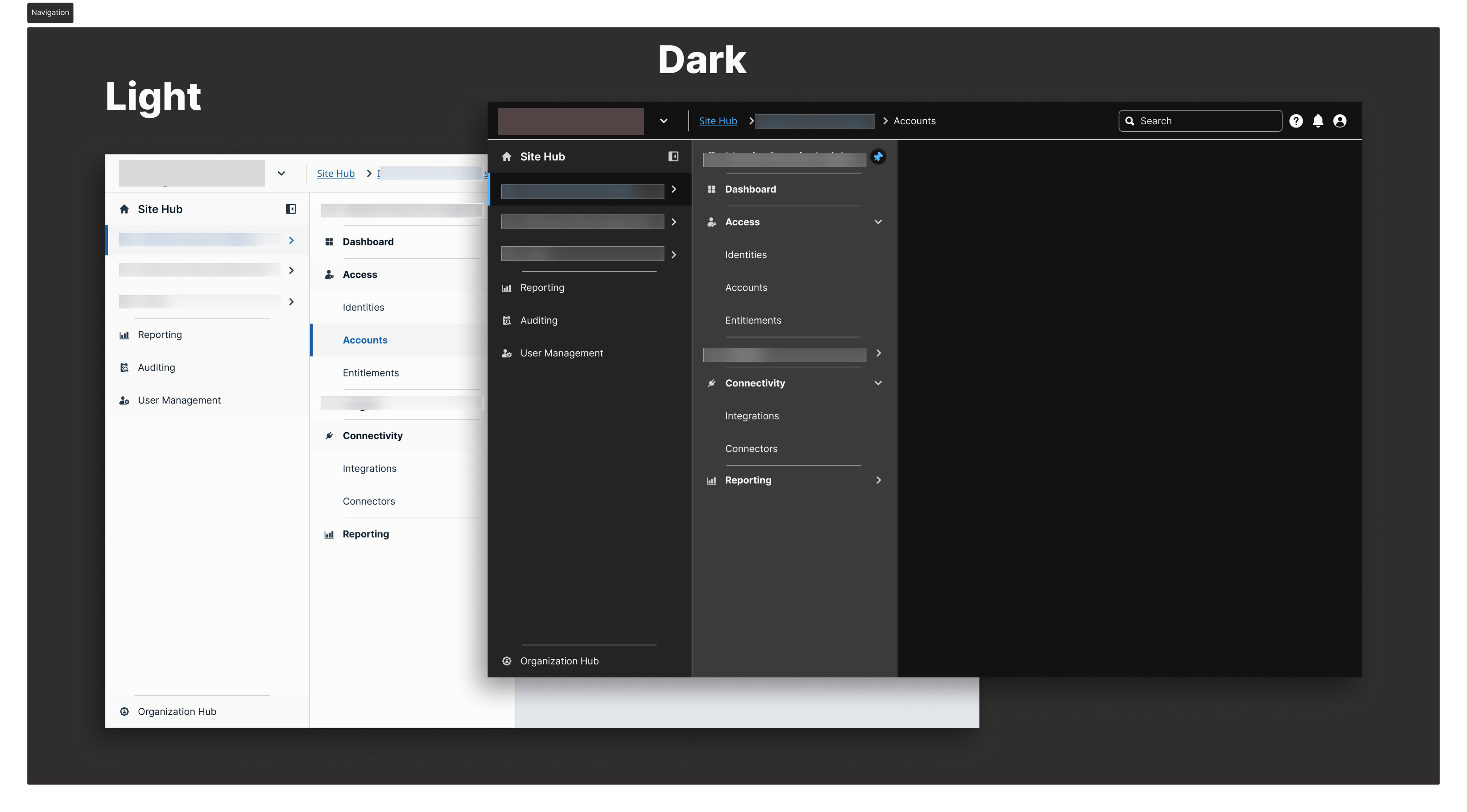
I developed the interaction model from an existing Figma concept. I collaborated with designers and engineers on tenant behavior, used variants and prototypes to make transitions reviewable, and aligned the visual treatment with the design system.
The decisions
Separate location from disclosure.
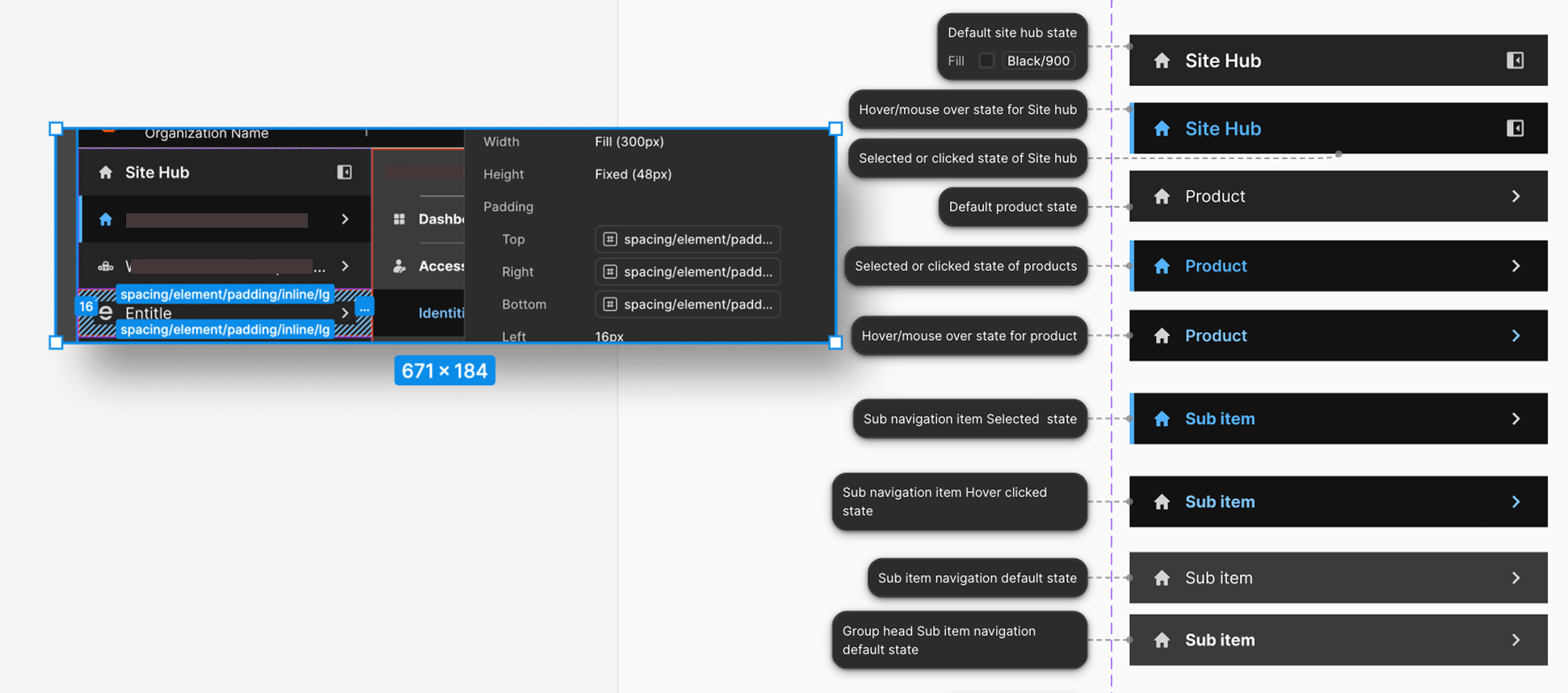
“Selected” communicates where the person is. “Expanded” communicates that a group is open. Treating them as the same state made the hierarchy ambiguous.
Treat pinning as an action.
I explored multiple pin indicators, then used action-based labels such as “Pin to sidebar” and “Unpin from sidebar.” The pattern included feedback and persistence within a tenant.
Define the state model before handoff.
Hover, focus, active, pinned, expanded, and collapsed states were documented together. That let engineering assess transitions instead of reconstructing behavior from separate screens.
Use the prototype to resolve behavior.
The working proof of concept supported reviews of persistence, animation, and cross-tenant behavior. Keyboard and focus checks were part of the documented design work.
A closer look
Where you are in the product.
Which group is open.
Where keyboard input will act.
What stays available in the sidebar.
What changed
The handoff connected a state map, Figma interactions, and the engineering proof of concept. The team had observable behavior to discuss for pinning, collapse, persistence, and tenant switching.
Project status
The reported validation is design and engineering review through a proof of concept. It is not presented as a measured improvement in task completion or a production rollout.
What I learned
Navigation is a set of rules people learn by using it. The component’s appearance only becomes meaningful when selected, expanded, focused, and pinned states have distinct jobs.
Next project
The system behind the screens. ↗